sRGB vs. Adobe RGB vs. ProPhoto RGB | When (not) to use Wide Gamut Color Profiles
Do you have more leeway when you edit your photos in a wide color gamut like ProPhoto RGB? Well, It depends on where you expect leeway or room for editing. Adobe RGB contains more information color. That means the colors in Adobe RGB can go deeper or have more saturation than in sRGB. ProPhoto RGB can go even deeper. than that.
sRGB vs. Adobe RGB vs. ProPhoto RGB Cheat Sheet
This article is a lot to take in. If you came here for the quick fix, decide here what is the best color profile for your needs.
Processing
Process your images in sRGB if: your colors are muted to begin with and do not aim to bring them out. sRGB is limited in saturation, but does offer the most leeway for editing skies that are prone to banding.
Process your images in Adobe RGB if: if you desire a trade-off between banding resistance and better color saturation. Be aware though, that Adobe RGB is closer to ProPhoto RGB than it is to sRGB. A good use case is when the sky contains many different colors, but isn’t very gradual anywhere. (sunsets, northern lights, lightning). I never use this, but choose one of the other options.
Process your images in ProPhoto RGB if: if you intend to print at some point in the future and when the image does not have a gradual sky or other areas of interest where smooth transitions are key.
Exporting
Export your images in ProPhoto RGB when: don’t. I know of no hardware that currently supports it.
Export your images in Adobe RGB when: you intend to upload your image on a website that supports Adobe RGB outright. I know 500px does. Some contests like International Landscape Photographer of the Year also require you to upload your images within the Adobe RGB color space. Some printers like White Wall and Saal Digital also like it when you export Adobe RGB.
Export your images in sRGB: in all other cases.
MAKE SURE TO EMBED THE COLOR PROFILE ON EXPORT. I cannot stress this enough. If you do not, your colors will not look as intended across browsers and consequently to your viewers.
sRGB vs. ProPhotoRGB: Real World Example
Alright now that we’ve got those recommendations out of the way, I will first bring some examples to the table to back up my words. Words mean quite little in photography anyway.

Our test image. Image “processed” in ProPhoto RGB, converted to sRGB on export with embedded profile.
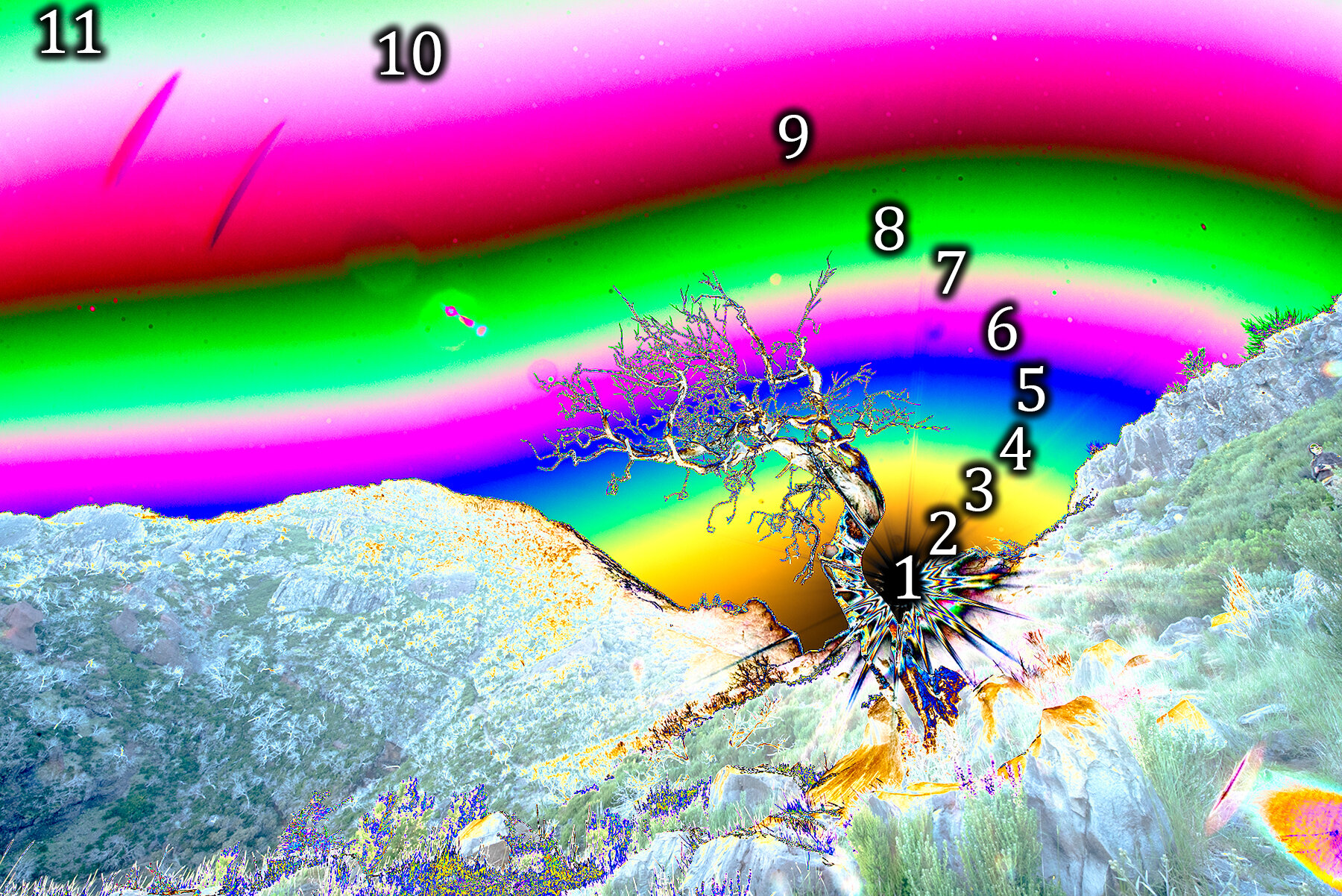
Image “processed” in ProPhoto RGB, added solar curve and nothing else, converted to sRGB on export with embedded profile.

Image “processed” in sRGB, added solar curve and nothing else, exported with embedded profile.
Notice two differences in the above images. The fact that the colors are different and that there are numbers that differ in density and amount. So what do all those colors mean? What do the numbers mean?
The numbers, Mason. What do they mean?

What is Banding?
For this benchmark, I’ve applied the same curve to both images. This is what is known as a solar curve. It brings out banding, bad editing and makes your photos looks like shit. The colors you see in the previous comparison represent nothing else but values. The closer those values are together in an area such as a gradual sky, the more pronounced the effect of banding. Banding or posterization is an effect that occurs when there is insufficient color depth to resolve the specific color tone. Skies typically end up looking like there are various steps between each shade of blue. The more you can count actual colors after you apply such a bizarre curve, the more banding will occur.
How to prevent Banding
In order to prevent banding, always edit your images in as high a bit depth as possible. Realistically, that means that you pick 16 bits per channel in the software that you’re using. Additionally you may want to pick a wide a color profile as possible. That is not true.
Consider this analogy. In front of you there are two buckets of different sizes. One holds exactly one liter. the next one holds exactly two liters. Now you have two liters of water in a bottle. Fill the 1 liter bucket and put the liter you have left in the big one. Both buckets now contain a liter each.

The difference between the buckets is that one is half full, while the other is filled to the brim. Now think of the bucket as your image and the water as the amount of saturation in your image. sRGB simply cannot get any more saturated than it currently is. ProPhoto RGB on the other hand, has a lot of room for adding some more. But here’s the kicker. When you process your images, you don’t actually add more water to your bucket. You add room.
Water expands when its temperature increases. Much like increasing the temperature of the water, you expand the amount of detail in your images without adding actual light. If you were to put both buckets on the stove, what would happen? That’s right, the sRGB one will overflow, while the ProPhoto RGB one will not. But does the big bucket contain more water?
If you choose ProPhoto RGB and increase contrast (and saturation as a result) in processing, it’s like turning up the stove. You excite the water molecules and they take up more space as a result. Saturation is free to increase, but that has to come from somewhere.
For the sRGB bucket, there is no room for expansion. The volume of the water increases with temperature and the bucket floods. While the bucket still contains 1 liter of water, there is now less water in the bucket. That’s because there are less water molecules in the bucket.
And that’s where those numbers come in.

Small bucket and 10 and 11 got out of the bucket as we increased the temperature (contrast).

Big bucket with all numbers crammed in there.
Actually, pressure cooker might be a better analogy come to think of it, but I recon you’re tired of sixth-grade physics experiments. What you need to understand is all in the pictures. Look at the amount of countable colors. The more there are, the less space they inhabit. And this means that we see the sky as stepped shades of blue instead of a gradual color.
The correct course of action is choosing a limited enough color profile, that does not overflow the bucket. When you put it on the stove. If your saturation is limited and you do not intend on increasing it in post (by much), then pick sRGB.
When to pick Adobe RGB or ProPhoto RGB
A couple of results from the lab. All of these have embedded profiles, but are not converted to sRGB upon export. That means they will look different depending on which device and browser you view them and that the hue of them will look different.

ProPhoto RGB

Adobe RGB

sRGB
So the hue may be different among these three. But the important thing here is that the green parts are much wider and less gradual in the first (ProPhoto RGB) example than in the other two. Again, it’s the same image, from green to black, processed only with the solar curve from before. What does this mean?
The fact that the green area of ProPhoto RGB is wider, is because this gamut offers more saturation that is unviewable on the web with current technology. That means that should you push your images beyond what you can see in sRGB or Adobe RGB, then any shade beyond that will appear out of gamut. In practice, those areas look like they’re artificially filled in with a color instead of other colors transitioning to it.
Pick AdobeRGB during export only when you know that you are going to print and that the printer requires that specific profile or if you put it on a website that offers both Adobe RGB and sRGB versions of that image. 500px for instance, converts any Adobe RGB image to sRGB as well, so viewers with a wide gamut display can view the additional color depth. How out of gamut colors are handled, depends on which intent is chosen when converting or assigning profiles. I highly recommend reading on this at Cambridge in Colour. Going into this here is outside of the scope of this already lengthy article.
Choosing a Color Profile in Practice
I use Adobe Bridge and Camera Raw to convert my raw files. I then open those in Photoshop to further process my work and export them for the web (legacy export option). Here’s how I make sure colors are both correct and as deep as they possibly can.
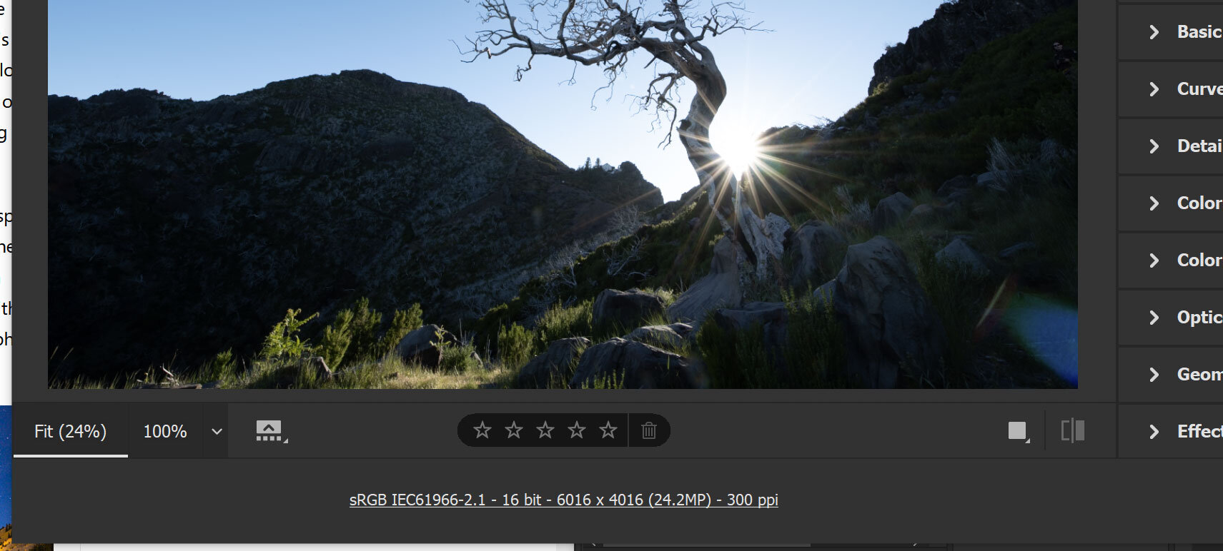
In Camera Raw, click the line of text underneath the photo.

That will lead you here. For Space select sRGB or ProPhoto RGB, depending on the needs of this particular photo. For Depth always select 16 Bits/Channel. No reason to ever set that to 8.

When you’ve finished processing your image, export for the web (Control+Alt+Shift+S) / (Cmd+Option+Shift+S). Then check both “Embed Color Profile” and “Convert to sRGB”.
More technical aspects of post-processing? Check out this article!